All pins, no narrative — the maximalist collage view. The board as a wall you can stare at until the thesis makes sense on its own.
Vol. I · Bauhaus Warm · The Report
Hyper-rich report
Everything we know about this guide in a single markdown document, intended to be fed directly into an LLM or image model — vibe prose, tag soup, the regeneration prompt, and the source pin index. Use the Copy button — the entire report goes to your clipboard.
# Bauhaus Warm
> Primary colors as primary structure — geometry that teaches by being seen.

— **Era / aesthetic period:** 1920s Bauhaus
— **Dominant mood:** precise, playful, didactic, restrained
— **Palette (most populated → least):** #e63946 · #f1c40f · #3498db · #2c3e50

## 1 — Vibe report

This guide reads as **precise, playful, didactic** — Bauhaus Warm
is built on warm color temperatures sitting at an average brightness of
0.49 (mid-key) and an average saturation of
0.64 (saturated). The palette skews toward
warm — wine / brick / oxblood with 4 distinct colors carrying signal —
the top three hexes (#E63946, #F1C40F, #3498DB) carry the bulk of the visual weight.

### Imagery & subject matter
Across 6 source pins, the subjects cluster around portrait, still life. Compositionally the guide leans
portrait — vertical, hierarchical, with image dimensions averaging
0.88 (near-square). The board reads as
restrained and reductive;
24 distinct color buckets surveyed across all pins.

### Lighting & materials
**Lighting reads as flat north-window even — no drama.** Material vocabulary: painted wood, felt, canvas, tubular steel.
Material range is tight — the guide commits to a small set of surfaces.

### Typography
Type pairs as: **geometric sans display / futura body / lowercase only**.
A three-voice system — display, body, caption — is implied.

### Internal tensions
- **didactic vs playful** — strict geometry that grins — the lesson is a toy. Resolution: pick ONE side per artifact; mixing reads as confused.

### What this is NOT
- not gradients
- not mixed type families
- not organic curves

## 2 — Tag soup

Drop this into image-gen prompts or semantic-search systems as-is.

```
precise, playful, didactic, restrained, painted wood, felt, canvas, tubular steel, geometric sans display, futura body, lowercase only, 1920s bauhaus, portrait, still life, primary colors, geometric
```

## 3 — Pop-culture & art-historical references

If a designer reads this guide and squints, here are the cultural neighbors they should picture:

- **Calexico Labs / Verily marketing** — sterile clean-room palette
- **Massimo Vignelli for Knoll** — monospace + sans + tabular numerals
- **Herbert Bayer typography** — lowercase universal, geometric primaries
- **Anni Albers textile grids** — didactic color sequencing
- **A24 brand identity** — restraint as luxury signal
- **Helmut Lang archives** — reduction past the point of comfort

These aren't templates — they're tuning forks. Use them to calibrate, not copy.

## 4 — Regeneration prompt

Paste into Midjourney / Flux / DALL·E to produce a NEW image that embodies the guide.

```
hero image embodying a 1920s Bauhaus idiom, precise, playful, didactic, restrained mood, palette of #e63946, #f1c40f, #3498db, #2c3e50, materials: painted wood, felt, canvas, tubular steel, flat north-window even — no drama, editorial composition with negative space, photographed on medium-format film, no text artifacts, no watermark --ar 4:5 --no gradients mixed type families organic curves
```

## 5 — Source pin index

Every pin that fed this guide, with its palette stripe:

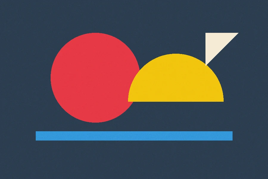
001. **circle exercise no. 4** — 900×600 · #e63946 #f1c40f #3498db #2c3e50
002. **canvas and felt** — 400×533 · #f4ead5 #e67e22 #2c3e50 #e63946
003. **cobalt study** — 400×533 · #3498db #2c3e50 #f4ead5 #1d6fa5
004. **cadmium pair** — 400×533 · #f1c40f #e63946 #d4ac0d #2c3e50
005. **workshop wall** — 400×533 · #e67e22 #f4ead5 #b35c11 #2c3e50
006. **graphite ground** — 400×533 · #2c3e50 #f1c40f #3498db #16222e
Vol. I · Bauhaus Warm · Prompt Canvas
The canvas
Pick a target, say what you're building, and the canvas wraps your brief in this guide — composed for exactly where you'll paste it.
Web / HTML
paste into Claude or ChatGPT to get a webpage
Designer brief
paste into Claude/GPT to get a creative brief
Image gen
paste into Midjourney, Flux, DALL·E
Design tokens
paste into Cursor, Copilot, Aider
The sample brief
“A landing page for a small-batch coffee roaster. One-pager. Email signup, three product cards, footer.”
Composed for Web / HTML — Bauhaus Warm riding along, ready to paste into Claude or ChatGPT
You are a senior creative director and frontend engineer. You have been given a style guide for a specific visual idiom, plus a project brief. Produce a single, self-contained HTML artifact that embodies the style guide and accomplishes the brief.

# Style guide

## The thesis
> Primary colors as primary structure — geometry that teaches by being seen.

## Era
1920s Bauhaus

## Palette
- `#E63946` (5 votes from source pins)
- `#F1C40F` (4 votes from source pins)
- `#3498DB` (4 votes from source pins)
- `#2C3E50` (3 votes from source pins)

## Typography
- geometric sans display
- futura body
- lowercase only

## Lighting
flat north-window even — no drama

## Materials
- painted wood
- felt
- canvas
- tubular steel

## Mood
- precise
- playful
- didactic
- restrained

## Do
- stick to three colors
- lowercase everywhere
- one geometric shape per page

## Don't
- gradients
- mixed type families
- organic curves

## Tensions
- **didactic vs playful** — strict geometry that grins — the lesson is a toy

# Brief
A landing page for a small-batch coffee roaster. One-pager. Email signup, three product cards, footer.

# Output requirements
- Output one complete HTML document, `<!doctype html>` through `</html>`.
- Inline all CSS in a single `<style>` block. No external assets, no JS frameworks, no `<script>` unless the brief explicitly requires interactivity.
- Use the palette hexes verbatim. Don't invent new colors.
- Use the typography descriptors literally — if it says "serif italic display," apply `font-family: Georgia, "Times New Roman", serif; font-style: italic` and pick a large size.
- Honor every Do and every Don't. If "no gradients" is on the Don't list, do not use a single gradient anywhere.
- Lead with whitespace. Restraint over decoration. Let the typography speak.
- No commentary outside the HTML. Don't explain — produce.

Begin.
'%2F%3E%3Cellipse%20cx%3D'285'%20cy%3D'150'%20rx%3D'150'%20ry%3D'125'%20fill%3D'%232c3e50'%20opacity%3D'0.5'%2F%3E%3C%2Fsvg%3E)
'%2F%3E%3Cellipse%20cx%3D'285'%20cy%3D'150'%20rx%3D'150'%20ry%3D'125'%20fill%3D'%23f4ead5'%20opacity%3D'0.5'%2F%3E%3C%2Fsvg%3E)
'%2F%3E%3Cellipse%20cx%3D'285'%20cy%3D'150'%20rx%3D'150'%20ry%3D'125'%20fill%3D'%23d4ac0d'%20opacity%3D'0.5'%2F%3E%3C%2Fsvg%3E)
'%2F%3E%3Cellipse%20cx%3D'285'%20cy%3D'150'%20rx%3D'150'%20ry%3D'125'%20fill%3D'%23b35c11'%20opacity%3D'0.5'%2F%3E%3C%2Fsvg%3E)
'%2F%3E%3Cellipse%20cx%3D'285'%20cy%3D'150'%20rx%3D'150'%20ry%3D'125'%20fill%3D'%233498db'%20opacity%3D'0.5'%2F%3E%3C%2Fsvg%3E)